Understanding the Weather Application Structure
When building a GTK4 and Libadwaita application, we are not only writing code. We are designing a graphical interface made of different UI components called widgets.
Widgets are the visual elements that users interact with. Examples include buttons, text labels, lists, and layout containers.
In this Weather Application, every visible part of the interface is built using widgets from GTK4 and Libadwaita.
GTK4 provides the basic building blocks such as GTK Box, GTK Button, GTK Label, GTK ListBox, GTK Stack, and GTK Popover.
Libadwaita provides modern GNOME interface components such as HeaderBar, NavigationSplitView, StatusPage, ActionRow, MessageDialog, and Breakpoint.
Before learning each widget individually, it is helpful to first look at how the whole application is structured.
What the App Looks Like When It Starts
When the Weather Application runs for the first time, there are no cities saved yet. Because of this, the interface shows an empty state.
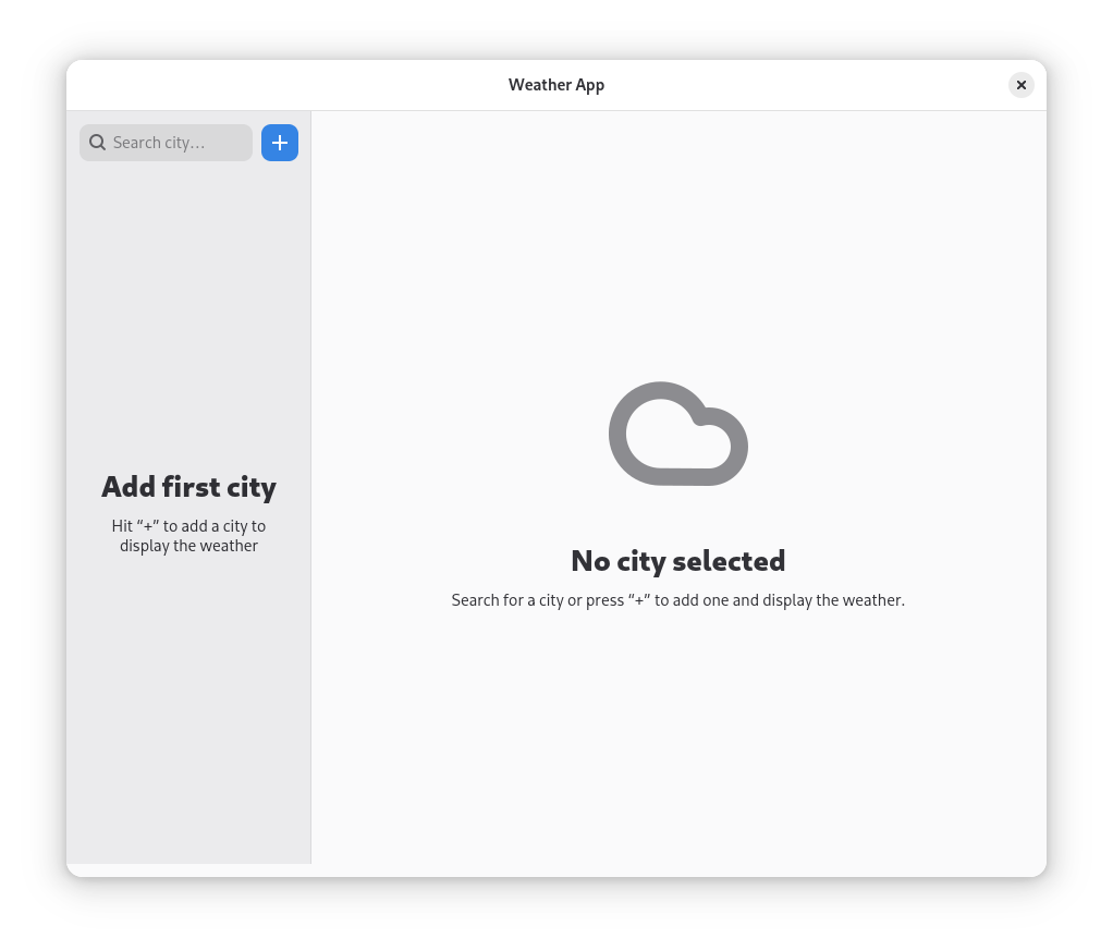
Figure 1 shows the application when it first opens.
At the top of the window, we can see the HeaderBar.
The HeaderBar replaces the traditional menu bar and gives the application a modern GNOME design.

Figure 6: HeaderBar showing the application title and navigation controls.
Inside the header bar, a GTK Label displays the title of the application, and GTK Button widgets provide navigation controls.
Below the header bar, the layout is divided using NavigationSplitView.
This widget creates two areas in the application: a left sidebar and a right content area.
Inside the sidebar, we use a vertical GTK Box to arrange elements from top to bottom.
At the top of this box, there is a GTK SearchEntry which allows users to search for cities.
Next to it, there is a GTK Button with a plus icon used to add a new city.
Since no city has been added yet, the sidebar displays a StatusPage.
The StatusPage is a Libadwaita widget used to show helpful messages when there is no data to display.
Instead of showing an empty area, it guides the user with a message such as “Add your first city.”
This design makes the application feel complete even when it contains no data yet.
What the App Looks Like After Adding a City
After a city is added and selected, the interface changes and shows the weather details.
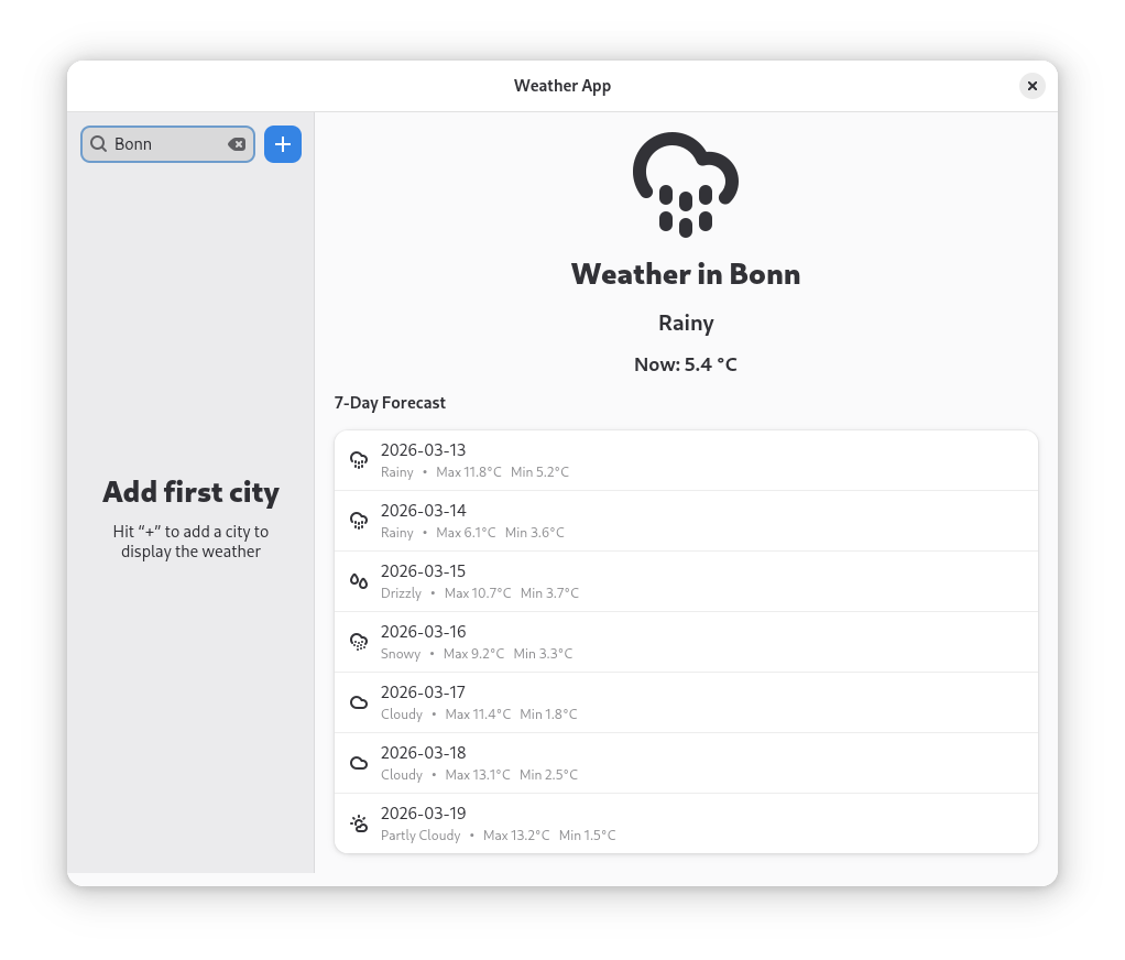
Figure 2 shows the application after a city has been added.
The NavigationSplitView now clearly divides the app into two working areas.
The left side displays the saved cities list.
The right side shows the weather information for the selected city.
The list of cities is displayed using GTK ListBox.
Each city is represented using an ActionRow.
ActionRow is a Libadwaita widget designed for list items that contain structured information.
Each row shows the city name and may include additional elements such as icons or buttons.
In this app, each row also includes a GTK Button with a trash icon that allows the user to delete the city.
On the right side of the window, the weather details are displayed.
This part of the interface is controlled by a GTK Stack.
A GTK Stack allows multiple views to exist in the same area but shows only one at a time.
When no city is selected, the stack shows an empty view. When a city is selected, it switches to the weather information view.
Inside the weather view, different widgets are used.
A GTK Image displays the weather icon.
GTK Label widgets display the city name and the current temperature.
Below this information, another GTK ListBox displays the 7-day weather forecast.
Each forecast entry is again displayed using an ActionRow.
This shows how widgets such as ListBox and ActionRow can be reused for different purposes within the same application.
The Main Controller of the Application
Every GTK application starts with an Application.
In Libadwaita applications, we use AdwApplication.
The Application is not visible to the user.
Instead, it controls how the program starts and how windows are managed.
It connects the application to the operating system and ensures that everything runs correctly.
You can think of the Application as the manager of the program.
It starts the application, keeps it running, and manages its windows.
Without an Application, the program would not be able to create any windows.
The Main Window of the Application
The first visible part of the program is the ApplicationWindow.
The ApplicationWindow acts as the main container for the entire interface.
It defines the size of the application and holds all other widgets.
At the top of the window, we place a HeaderBar.
The HeaderBar replaces the traditional menu bar and provides a modern GNOME-style top area.
Inside the header bar, we use:
GTK Buttonwidgets for navigation actions- A
GTK Labelto display the application title “Weather App”
A GTK Button is an interactive widget that performs an action when the user clicks it.
A GTK Label simply displays text on the screen.
Showing Messages to the User
Applications must guide users when something goes wrong.
In this Weather App, we use MessageDialog to show feedback messages.
MessageDialog is a Libadwaita dialog window that appears on top of the main application window.
For example, if the user tries to add a city without typing a name, the application shows a message explaining that the city name cannot be empty.
If the user tries to add a city that already exists, another dialog informs them that the city is already saved.
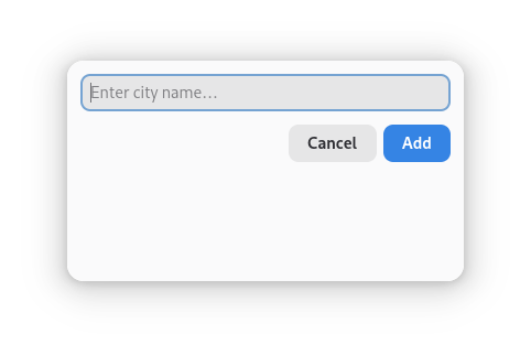
Figure: Dialog displayed when the user clicks the "+" button.
Dialogs temporarily block interaction with the main window until the user closes them. This ensures that important messages are noticed.
Dividing the Interface into Two Parts
To divide the window into a sidebar and a content area, the application uses NavigationSplitView.
NavigationSplitView is a Libadwaita widget that automatically creates a two-pane layout.
In this Weather App:
The left pane contains the city list and search tools.
The right pane displays the weather information.
On large screens, both panes are visible at the same time.
On smaller screens, the layout collapses so that only one pane is visible at a time.
This makes the application responsive and usable on different screen sizes.
Organizing the Sidebar Layout
Inside the sidebar, widgets are arranged using GTK Box.
A GTK Box is a layout container that arranges widgets either vertically or horizontally.
In the Weather App sidebar, we use a vertical box to place widgets one below another.
At the top of the sidebar, there is a horizontal box containing two elements:
A GTK SearchEntry, which allows users to type and search for cities.
A GTK Button with a plus icon, which opens the dialog for adding a new city.
Using boxes helps control spacing and alignment so that the interface looks clean and organized.
Handling the Empty Sidebar
When the application starts and no cities are saved, the sidebar would normally appear empty.
To improve the user experience, we use a StatusPage.
StatusPage is a Libadwaita widget designed to display helpful placeholder messages.
In this application, it shows a message encouraging the user to add their first city.
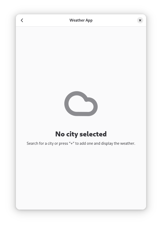
Figure: The application sidebar when no cities have been added yet.
This approach prevents the interface from looking incomplete.
Displaying the Saved Cities
The saved cities are displayed using GTK ListBox.
GTK ListBox is a container that organizes rows vertically.
Each city is displayed using an ActionRow.
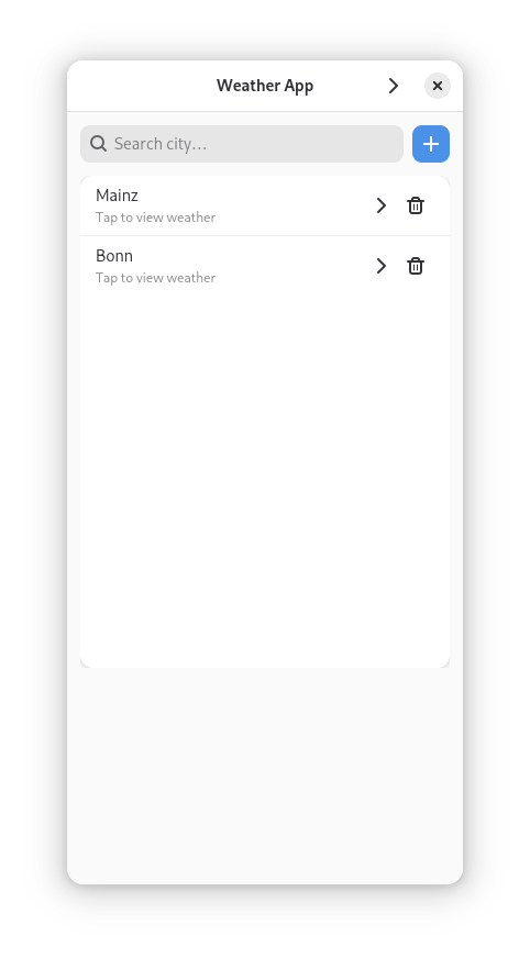
Figure: The sidebar displaying a saved city using a GTK ListBox and ActionRow.
An ActionRow usually contains:
A title (the city name)
Optional subtitle text
Optional icons or buttons
In this Weather App, each row also includes a delete button with a trash icon.
Because ActionRow follows GNOME design guidelines, it helps the application maintain a consistent and modern appearance.
Displaying Weather Information
The weather information is displayed in the right pane.
This area is controlled by a GTK Stack.
A GTK Stack allows multiple views to exist in the same area but only one is visible at a time.
The stack switches between:
An empty state view
The weather information view
Inside the weather view, several widgets are used.
GTK Label widgets display the city name and temperature.
A GTK Image shows the weather icon.
Below this information, a GTK ListBox displays the 7-day forecast.
Each forecast entry is displayed using an ActionRow.
Making the Interface Interactive
Widgets become interactive through signals.
Signals are events that occur when a user interacts with a widget.
For example, when a user clicks a GTK Button, the button emits a clicked signal.
The application then runs a function called a callback to respond to that event.
Examples in this application include:
Clicking the plus button opens the add city dialog.
Selecting a city row displays the weather information.
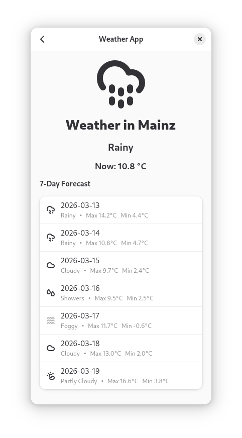
Figure: Navigation arrow allowing the user to move between the sidebar and the weather view.
Typing in the search field shows city suggestions.
Signals connect user actions with application behavior.
Showing City Suggestions
When the user types in the search field, the application displays city suggestions.
This is implemented using GTK Popover.
A GTK Popover is a floating container that appears near another widget.
In this case, the popover appears below the SearchEntry.
Inside the popover, we place a GTK ListBox containing suggestion rows.
This creates a dropdown-style list of possible cities.
Adapting the App to Different Screen Sizes
Modern applications must work on both large and small screens.
Libadwaita provides Breakpoint to support responsive design.
A breakpoint defines how the layout should change when the window becomes smaller.
In this Weather App:
When the window becomes narrow, the NavigationSplitView collapses.
Only one pane is visible at a time.
Navigation buttons allow the user to move between the sidebar and the weather view.
This ensures that the application works well on desktops, tablets, and small windows.