Layout Overview Designing the Application Structure
Before implementing logic, networking, or storage, a developer must define the user interface architecture.
This chapter explains how the Weather App layout is structured and why specific UI design decisions were made.
The focus here is not code syntax, but layout strategy and UI reasoning.
1. Purpose of the Layout
The Weather App must support:
- Desktop usage (wide screens)
- Tablet usage
- Linux mobile environments
Therefore, the UI must:
- Be responsive
- Separate navigation from content
- Avoid duplicate layouts for mobile and desktop
To achieve this, the application uses a structured layout hierarchy.
2. High-Level UI Architecture
The complete UI structure follows this hierarchy:
ApplicationWindow
    └── Vertical Layout
            ├── HeaderBar
            └── NavigationSplitView
                    ├── Sidebar (Cities)
                    └── Content Panel (Weather)
Each layer has a specific responsibility.
3. ApplicationWindow
The ApplicationWindow is the root container.
Responsibilities:
- Hosts the entire UI
- Manages window size
- Integrates with the GNOME desktop environment
- Handles breakpoints for responsiveness
This window is intentionally created with:
- A reasonable default desktop size (900x750)
- Flexibility for resizing
4. Vertical Layout Container
Inside the window, a vertical container is used.
Why vertical?
Because the interface is divided into:
- A fixed top area (HeaderBar)
- A dynamic content area (Split View)
This separation ensures that:
- The header remains stable
- Only the content area changes during navigation
5. HeaderBar (Top Navigation Layer)
The HeaderBar provides:
- Application title
- Navigation arrows (in mobile mode)
- Future action buttons (Add, Search, etc.)
Design reasoning:
- Modern GNOME applications use HeaderBar instead of traditional title bars
- It allows embedding actions directly in the top bar
- It adapts automatically to system themes
The HeaderBar does not scroll and remains constant.
6. NavigationSplitView - Core Layout Engine
The most important UI component in the layout is NavigationSplitView.
It allows:
- Two-panel layout on large screens
- Collapsible single-page layout on small screens
Desktop Mode
[ Sidebar | Weather Content ]
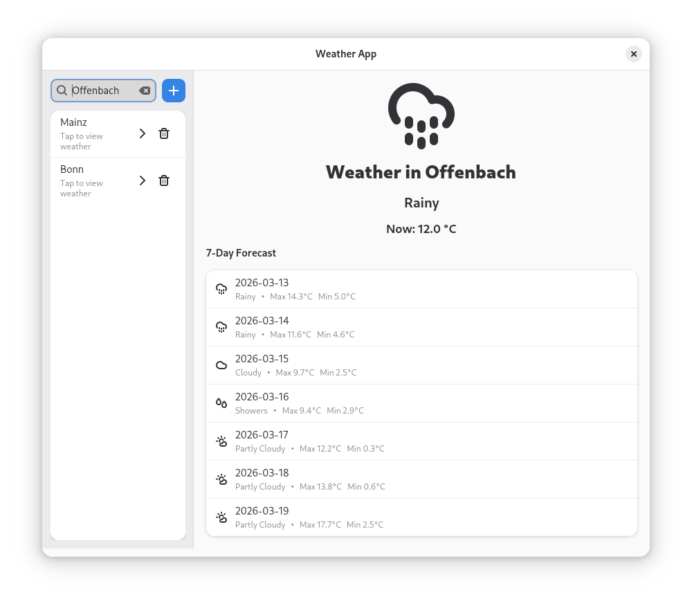
Figure: Desktop layout where the sidebar and weather content are visible at the same time.
Mobile Mode
[ Sidebar ]
   ↓ (select city)
[ Weather Content ]
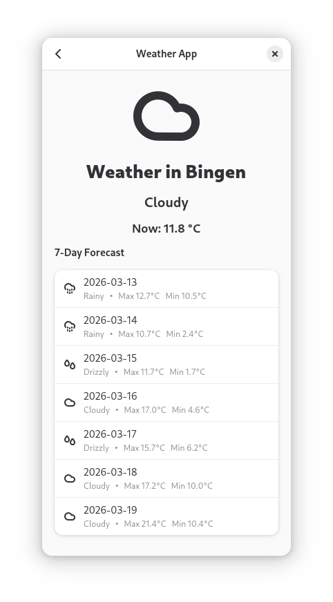
Figure: Mobile layout where only one panel is visible and navigation arrows allow switching between pages.
This eliminates the need to create separate UI files for desktop and mobile.
7. Sidebar (Navigation Panel)
The sidebar is responsible for:
- Displaying saved cities
- Providing search functionality
- Showing an empty-state message
Structurally, it contains:
- A search row (SearchEntry + Add button)
- A StatusPage (when empty)
- A scrollable list of cities
The sidebar acts as the navigation layer of the application.
It does not display weather data.
8. Content Panel (Information Layer)
The content panel displays:
- Selected city name
- Current temperature
- 7-day forecast list
It is implemented using a stack with two states:
- Empty state (no city selected)
- Weather display state
Why use a stack?
Because:
- At startup, no city is selected
- The UI should not display invalid or placeholder data
- State switching becomes clean and controlled
9. Responsive Design Strategy
Responsiveness is handled using breakpoints.
If the window width is small:
- The split view collapses
- Only one panel is visible at a time
- Navigation arrows become visible
If the window width is large:
- Both panels are visible simultaneously
- Navigation arrows are hidden
This design ensures:
- Desktop usability
- Mobile compatibility
- Consistent user experience
10. UX Design Considerations
Several user experience decisions were made:
- No weather shown before city selection
- Forward navigation disabled if no cities exist
- Clear empty-state instructions
- No duplicate "Add" buttons
- Navigation arrows only when necessary
These decisions prevent:
- User confusion
- Dead-end navigation
- Empty screens without explanation
11. Architectural Benefits
This layout design provides:
- Clear separation of concerns
- Logical UI grouping
- Expandability for future features
- Compatibility with Linux Mobile environments
- Maintainable structure for onboarding developers
It demonstrates modern GNOME application architecture using Libadwaita.