NavigationSplitView Internal Behavior and Adaptive Navigation Model
The NavigationSplitView is the architectural core of the Weather App’s interface.
This is not just a layout widget it defines how users move through the application.
1. Conceptual Model
At a high level, NavigationSplitView manages two regions:
NavigationSplitView
    ├── Sidebar (Navigation Layer)
    └── Content (Detail Layer)
These are not simple containers.
They are wrapped in NavigationPage objects to enable:
- Title handling
- Navigation transitions
- Stack-like behavior in mobile mode
Minimal structural setup looks like:
#![allow(unused)]
fn main() {
let split = NavigationSplitView::new();
split.set_sidebar(Some(&sidebar_page));
split.set_content(Some(&content_page));
}
This defines the two primary UI regions.
2. Expanded Mode (Desktop Behavior)
When the window is wide enough:
#![allow(unused)]
fn main() {
collapsed = false
}
Behavior:
- Sidebar and content are displayed simultaneously.
- Both panels share horizontal space.
- Navigation transitions are disabled.
- Back/forward arrows are hidden.
Visual layout:
[ Sidebar | Content ]
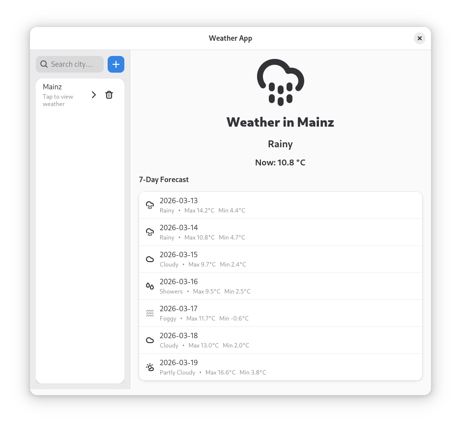
Figure: Desktop mode where sidebar and weather content are visible simultaneously.
Internally:
- Both pages are active.
- The layout engine distributes width proportionally.
show_contentproperty becomes irrelevant.
This mode optimizes:
- Efficiency
- Visibility
- Desktop multitasking
3. Collapsed Mode (Mobile Behavior)
When the window becomes narrow, the breakpoint forces:
#![allow(unused)]
fn main() {
collapsed = true
}
This fundamentally changes behavior.
Instead of a split layout, it becomes a navigation stack model.
Visual layout:
[ Sidebar ]
   ↓ select city
[ Content ]
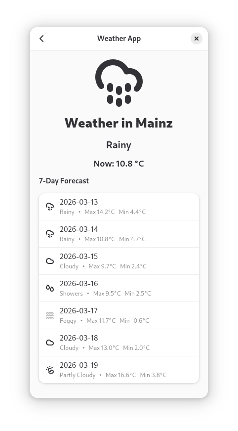
Figure: Mobile layout where the sidebar and content appear as separate navigation pages. Internally:
- Only one page is visible at a time.
- The widget transitions between sidebar and content.
- Animations provide visual continuity.
This creates a mobile-style navigation flow.
4. The collapsed Property Explained
The collapsed property determines layout strategy.
Example of setting collapse behavior via breakpoint:
#![allow(unused)]
fn main() {
bp.add_setter(&split, "collapsed", Some(&true.to_value()));
}
Meaning:
If breakpoint condition is met → force split view into stacked mode.
Important:
Developers do not manually detect window resize events. Libadwaita handles this automatically.
This reduces complexity significantly.
5. The show_content Property Explained
When in collapsed mode, we need to control which page is visible.
This is done using:
#![allow(unused)]
fn main() {
split.set_show_content(true);
}
or
#![allow(unused)]
fn main() {
split.set_show_content(false);
}
Meaning:
false→ show sidebartrue→ show content
This property is ignored in expanded mode.
6. Navigation Flow Logic
In mobile mode:
- App starts with sidebar visible.
- User selects a city.
- Application sets
show_content = true. - Weather panel becomes visible.
Back navigation:
#![allow(unused)]
fn main() {
split.set_show_content(false);
}
This returns the user to the sidebar.
This creates predictable navigation without manual page stacks.
7. Why Not Use GtkPaned?
GTK provides GtkPaned for split layouts.
However:
| GtkPaned | NavigationSplitView |
|---|---|
| Static layout only | Adaptive layout |
| No automatic collapse | Automatic collapse |
| No stack navigation | Built-in stack model |
| Manual resize logic | Declarative breakpoint |
| Not mobile-focused | Designed for GNOME adaptive apps |
For Linux mobile onboarding, NavigationSplitView demonstrates modern best practices.
8. Interaction With HeaderBar
In collapsed mode:
- Navigation arrows appear.
- They toggle
show_content.
Example logic:
#![allow(unused)]
fn main() {
next_btn.connect_clicked(move |_| {
    split.set_show_content(true);
});
}
and
#![allow(unused)]
fn main() {
back_btn.connect_clicked(move |_| {
    split.set_show_content(false);
});
}
In expanded mode:
- Arrows are hidden.
- Both panels are visible.
- Navigation buttons are unnecessary.
This dynamic visibility improves UX clarity.
9. Internal State Model
The widget internally manages:
- Layout mode (
collapsed) - Visible page (
show_content) - Transition animations
- Page metadata (via NavigationPage)
This creates a clean separation between:
- Navigation layer (sidebar)
- Content layer (weather panel)
Developers only interact with high-level properties.
They do not manage animation stacks manually.
10. Developer Onboarding Perspective
From a learning standpoint, this widget teaches:
- Adaptive UI thinking
- Separation of concerns
- Declarative property-driven design
- Mobile-first architecture
It removes the need to teach beginners:
- Window resize signals
- Manual layout recalculations
- Complex conditional rendering
This reduces onboarding difficulty.
11. Architectural Significance for the Thesis
The use of NavigationSplitView demonstrates:
- Modern Libadwaita design patterns
- Adaptive GNOME application architecture
- A single codebase targeting desktop and mobile
- Clean UI separation
It serves as a concrete case study of:
How structured UI components reduce cognitive load in developer onboarding.