Responsive Design Adaptive Layout in GTK + Libadwaita
Modern Linux applications must work on:
- Desktop environments
- Tablets
- Linux mobile systems
Instead of writing separate layouts for each device type, the Weather App uses Libadwaita’s adaptive system.
1. What Is Responsive Design in GTK?
Responsive design means:
The interface adapts automatically depending on available window size.
Instead of detecting “desktop vs mobile”, the application reacts to actual width constraints.
This is more flexible because:
- Users can resize windows manually
- Tablets vary in size
- Desktop users may use small windows
2. The Breakpoint Concept
Libadwaita introduces the concept of a Breakpoint.
A breakpoint defines:
A condition under which a UI property should change.
In this project, the breakpoint controls whether the split view collapses.
3. Minimal Code Snippet Defining a Breakpoint
The Weather App defines a breakpoint like this:
#![allow(unused)]
fn main() {
let bp = Breakpoint::new(
    BreakpointCondition::new_length(
        BreakpointConditionLengthType::MaxWidth,
        600.0,
        LengthUnit::Sp,
    )
);
}
What this means:
- If the window width is ≤ 600sp
- Then a layout change should occur
Sp means a scalable unit that adapts better to different screen sizes and display settings.
In simple terms:
- It is not just a fixed pixel value
- It helps the interface behave more consistently across devices
- It is more suitable for adaptive UI design than raw pixels
This is why Sp is used here instead of px.
4. Applying the Breakpoint
The breakpoint is connected to the split view:
#![allow(unused)]
fn main() {
bp.add_setter(&split, "collapsed", Some(&true.to_value()));
}
This means:
When the condition is met → set collapsed = true.
So:
- Wide window → collapsed = false
- Narrow window → collapsed = true
No manual resize handling is required.
5. What Happens When Collapsed?
When collapsed = true:
- Sidebar and content are no longer shown side by side
- Only one page is visible at a time
- Navigation behaves like a stack
The visible page is controlled by:
#![allow(unused)]
fn main() {
split.set_show_content(true);
}
or
#![allow(unused)]
fn main() {
split.set_show_content(false);
}
This determines:
false→ show sidebartrue→ show content
6. Expanded Mode (Desktop)
When window width > 600sp:
- Both panels are visible simultaneously
- No navigation arrows are required
show_contentbecomes irrelevant
Layout looks like:
[ Sidebar | Weather Panel ]
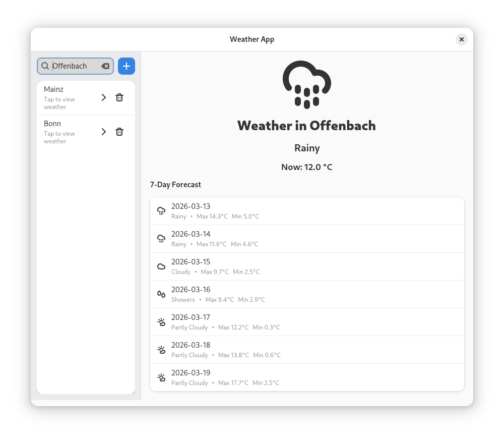
Figure: Expanded desktop layout where the sidebar and weather panel are visible at the same time.
This supports efficient multitasking.
7. Collapsed Mode (Mobile)
When window width ≤ 600sp:
Layout becomes:
[ Sidebar ]
   ↓
[ Weather Panel ]
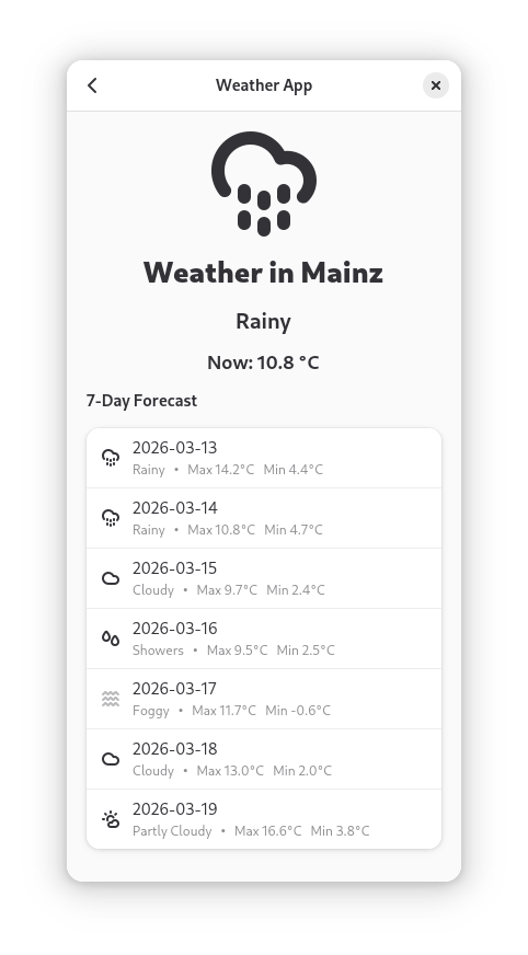
Figure: Collapsed mobile layout where only one panel is visible and navigation arrows allow switching between sidebar and content.
Only one page at a time is visible.
Navigation arrows are shown in the header bar.
This improves:
- Touch usability
- Focus
- Clarity
8. Why This Matters for Developer Onboarding
For beginners, responsive design is often complex because it typically requires:
- CSS media queries (web)
- Separate UI files
- Manual resize detection
- Conditional layout logic
Libadwaita simplifies this to:
- Define breakpoint
- Attach property change
- Let framework handle transitions
This reduces cognitive load.
New developers can focus on:
- Application logic
- Data handling
- UX decisions
Instead of fighting layout complexity.
9. UX Implications of Responsiveness
Responsive behavior in this app ensures:
- No wasted space on desktop
- No cramped interface on mobile
- Clear navigation transitions
- Consistent user experience
Additionally:
- Navigation arrows are hidden in expanded mode
- Forward navigation is disabled if no city exists
- Empty state is shown appropriately
This prevents user confusion.
10. Architectural Benefits
This design:
- Demonstrates adaptive UI principles
- Encourages modern GNOME development practices
- Aligns with Libadwaita philosophy
- Supports Linux mobile compatibility
- Keeps code maintainable
It also proves that:
A single Rust + GTK codebase can target both desktop and mobile effectively.